


The visual storytelling team at the Financial Times has developed a “playbook” for covering events like the war between Israel and Hamas since it was created in 2021.
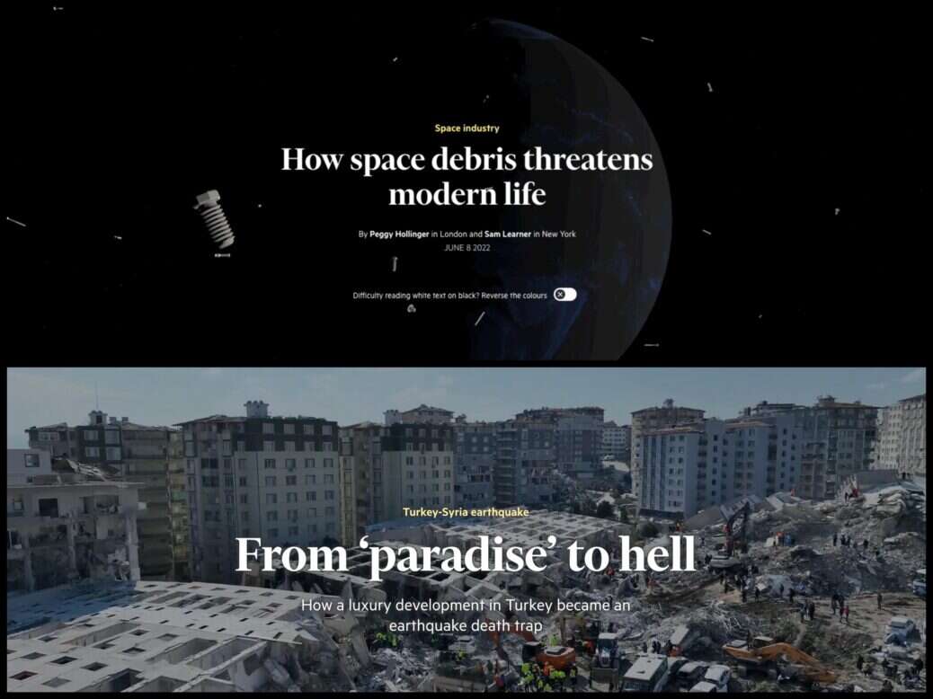
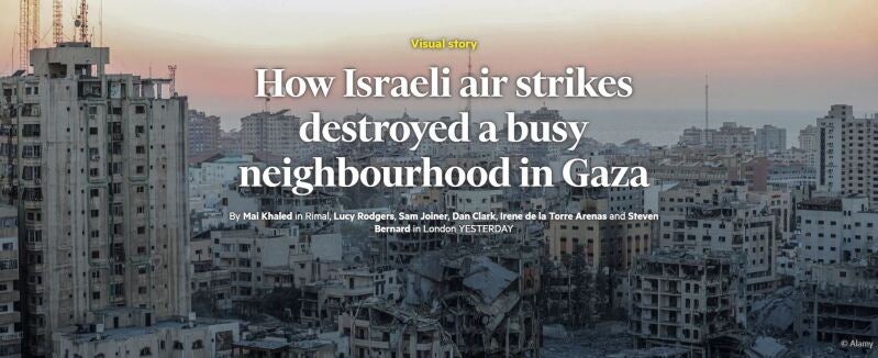
In the first week of the conflict, the FT’s visual and data teams began a regularly updated “war in maps” piece and published the visual investigation “Seventeen hours of terror: how Hamas invaded one Israeli community” using surveillance and mobile phone footage alongside witness testimony to piece together what happened when at least 110 people were killed in one town on Saturday 7 October. The visual team later investigated the question: “Did Israel bomb a civilian evacuation route in Gaza?” and revealed “How Israeli air strikes destroyed a busy neighbourhood in Gaza”.
Sam Joiner, the FT’s head of visual stories, spoke to Press Gazette at the end of the first week of the conflict, which had been “all hands on deck” in the newsroom.
He said: “The visual and data team, we’ve got a good playbook for how we will cover these things, and then build on that playbook. So you need to situate readers, you need to show them the scale, where things are happening, how they’re happening, and explain that visually to aid people’s understanding.”
Related


FT data journalist John Burn-Murdoch suggested last week that “large parts” of the media kept “slipping up” on coverage of what was going on in the war between Israel and Hamas, including who was responsible for the bombing of a hospital in Gaza on Tuesday 17 October, because many large newsrooms still do not have open source intelligence (OSINT) investigation teams. “This means that when you have events unfolding rapidly amid a fog of war, most news orgs are still completely reliant on what they’re told by their sources,” he wrote on X.
The war began as the FT launched a dedicated visual investigations team, hiring Alison Killing, who in 2021 won a Pulitzer Prize with Buzzfeed News, as a senior visual investigations reporter, alongside Peter Andringa, formerly of the Washington Post, as a graphics journalist. The unit is completed by designer Chris Campbell, who has been at the FT since 2011.
Content from our partners


“Those three will be producing public interest journalism that uses visual evidence to reveal stories of global significance,” Joiner said, adding that this can take the form of both quick turnaround verification-based stories and longer-term examinations of major global stories.
Joiner, who oversees the unit, said the existing visuals team had proved with the war in Ukraine among other stories that they can do this visual investigations work – which can include verifying content from social media using tools and techniques like satellite imagery, video footage, geolocation and getting first-hand accounts – but the new unit will “supercharge that work and take it to new heights”.
Through doing this work they can also discover new stories that have not yet been told, leading to more OSINT-driven commissioning in the newsroom.
FT visual stories ‘over-index’ on engagement metrics
The FT’s visual storytelling team has been recognised for two years running at Press Gazette’s Future of Media Awards.
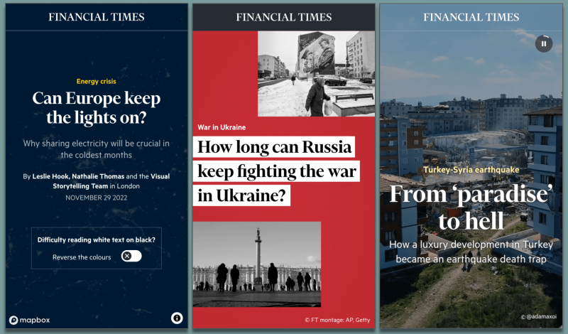
It won the Digital Media Excellence award in 2022 for its coverage of the Ukraine war, and in September won the Digital Storytelling prize for its visual investigation on oil smuggling into North Korea.
Joiner explained that having a dedicated investigations unit will also make it easier for the rest of the team to concentrate on the other types of stories that do well for them – explanatory pieces about how the world really works whether it’s via quantum computing, generative AI or the British countryside.
“It is hard to explain the world and investigate it in one piece,” Joiner said. “You kind of need two teams doing that. To go very forensic is a slightly different skill set – you’re looking for the needle in the haystack, the one thing that reveals something new. And then our visual stories should be explaining the much broader context and using visuals to explain to you why and how some things happen. And there’ll be crossover between those two teams, it won’t be mutually exclusive.”
These explanatory stories often offer a “lightbulb moment” for readers, Joiner said: “If you break down these things, explain it to them, they get so much from those pieces, it helps them really understand the story and that in turn makes the project much more memorable.
“It’s this visceral response to showing people stuff that when you combine with great reporting becomes super powerful.”
This is why pieces from the visual and data teams “over-index” for engagement rates with readers, both among existing subscribers and for attracting new sign-ups. The comments also show this, Joiner said: “We get loads of comments saying like ‘before I saw this piece, I thought I understood the details, but now seeing the visuals and the words combined in this way I understand it very differently’. That kind of story really helps us. It’s very validating for why we do this work.”
These stories also help to show non-readers that the FT does not only cover companies, markets and business but has a much broader range in its newsroom. Covid-19 and Ukraine, neither of which fit into that stereotype, were both covered very well by the FT, Joiner – who was at The Times for the first year of the pandemic – said.
“The fact that we’re building a visual investigations team is again a reflection of that,” he said. “We will investigate core FT topics like supply chains and companies and explain the world’s veins and how the world really works. But we’ll also be doing other things linked to what’s happening in the Middle East, and those stories are really important for the FT and I think this is a good way of showcasing that to people who might not know us.”
Visual stories work best when reporters start with ‘blank canvas’
The visual team was formed in July 2021 with the arrival of Joiner and visual storytelling reporter Alexandra Heal. Joiner said he, FT editor Roula Khalaf and Alan Smith, head of visual and data journalism, had “similar ideas about what we needed for this team to work” which worked out as two graphic journalists, two reporters and a designer.
They were given a “pure focus on telling visual stories and the space, time and resources to do that” and, Joiner said, “once the Ukraine war started we were in a position where we could really prove ourselves.
“It was a chance for us to really explain to readers what was happening in Ukraine in a visually compelling way and situate readers and use visual evidence to drive the story and bring things to life in a way that you just can’t do with words alone.”
Commissioning for visual stories is a two-way process: the team proactively comes up with ideas and pitches them to reporters who they think might want to work on it, while reporters and correspondents also increasingly go to them directly with stories.
The process works best, Joiner said, when reporters start discussing an idea with them right at the start of the process. For example, Seoul bureau chief Christian Davies approached him about the potential project that ended up being the award-winning North Korea oil smuggling investigation before anything had been done.
“That’s really key in terms of how we want to work,” Joiner said. “We don’t want reporters to send us 1,000 words and then we’ll put some charts in it. That’s not what we do.
“We want to rethink stories from the ground up and starting with a blank canvas means having conversations from the very beginning about how you’re going to use evidence, how you’re going to use visuals, how you’re going to use data, whatever it is, to tell the story. And that kind of blank canvas work requires a discussion at the beginning and everybody to be on board with that.”
The ultimate goal, he added, is for it to be “the visuals driving the narrative”.
“I think it just leads to a more emotional, more visceral response from readers when you tell stories in that way.”
How visual journalism has ‘changed quite significantly’
It is a decade since the New York Times “changed journalism” (as the newsbrand itself has put it) and won the Pulitzer Prize for feature writing for its groundbreaking multi-media piece Snow Fall exploring what happened in a fatal avalanche in Washington State.
But even in just the past 18 months the medium of visual journalism has “changed quite significantly”, Joiner said.
The open source, maps and satellite-driven stories that became prevalent during the Ukraine war have moved the industry in that direction compared to the charts-heavy period of the Covid-19 pandemic.
What’s more, visual and data journalists can “tell so many more stories than you used to be able to with the proliferation of satellite data… and you can find things out that you just couldn’t have found out before the introduction of AI and things like that to those processes”.
For example, Joiner cited a “great” piece by the New York Times in March that tracked the Chinese spy balloon’s journey using AI and visualised it using a map and a timeline. “You just couldn’t do that a few years ago,” he said.
It has also become quicker to create these types of stories due to the development of the necessary tools and coding and greater ease for finding the necessary information, Joiner said.
“We can just turn things around far more quickly than when I first started doing this work a decade ago. We don’t have to take six weeks to build stories that are really visually impressive and compelling. And I think that that means we can do things that just weren’t possible. So that’s a huge change.”
He added that scoops were coming out of visual and data journalism techniques more regularly. “I think that allows you to produce accountability journalism that goes beyond what we were doing before, and I think that’s really important for us as a team and what we hope to achieve with it.
“The other thing I’d say, as well, is I think visual and data literacy has gone up post-pandemic. I think that people’s ability to comprehend and understand these stories – what you’re showing with data and what charts mean, and why they’re important – has gone up.”
Email pged@pressgazette.co.uk to point out mistakes, provide story tips or send in a letter for publication on our "Letters Page" blog