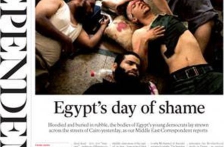
The Independent has unveiled its fifth redesign in as many years.
The red masthead brought in by then editor Chris Blackhurst in 2011 is gone and instead the masthead runs vertically down the left-hand side of the front page in the new look paper which hits newsstands for the first time this week.
Amol Rajan, who became editor in July, said he has immersed himself in the paper's first editions (it was launched in 1986) and wanted to capture its founding design ethos of being "classic with a twist".
Explaining the reasons behind the unusual use of the masthead he said:"We’ve done this for several reasons.
"First, it looks beautiful and elegant. Second, this newspaper has always dared to be radical, and been at its best when at its boldest, whether that be in downsizing to compact form, or launching i.
"Third, we want to create the feeling of a broadsheet in compact form, and by making the masthead vertical, we create much more height on the front page.
"Fourth, with the use of a font that is similar to our first masthead, this is certainly – and literally – classic with a twist.
"Finally, rather than being the same as everyone else, I want your newspaper to be different. As, I know, do you."
Independent content director Chris Blackhurst announced plans for a comment-focused relaunch of the title in July. A number of senior writers have been made redundant in recent months as the paper has invested more in digital (in July 27 redundancies were announced along with the creation of 20 digital-focused jobs).
The Independent had an average daily circulation of 69,388 in September, according to ABC, of which just over 52,000 were paid-for. The title costs £1.40 Monday to Friday and £1.80 on Saturdays.

Email pged@pressgazette.co.uk to point out mistakes, provide story tips or send in a letter for publication on our "Letters Page" blog
