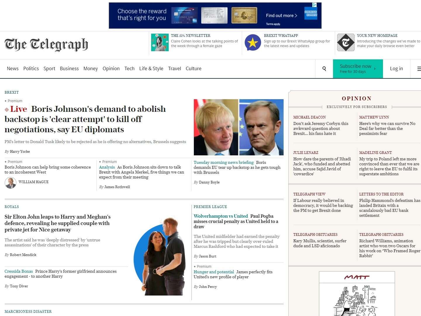
The Telegraph’s new-look website homepage, which went live yesterday, has already drawn comparisons with that of the New York Times.
In a message to readers, editor Chris Evans said the homepage had been “designed absolutely with you in mind” with important stories and opinion pieces positioned “at the top of the page”.
Stories at the top of the page are now grouped in blocks by theme, for example “Brexit” or “royals”, with a news story, analysis and live blog, and/or other content, linked by that theme.
Previously this was only done for major breaking news stories, with articles otherwise standing alone on the page, but Press Gazette understands the aim is for this to become a standard approach on the site.

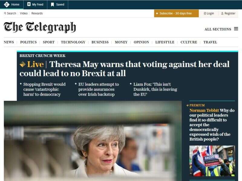
The old Telegraph homepage
The homepage also has four new “page areas”, including “Headlines” for top news stories, “Downtime” for arts and culture, “Inside Story” for in-depth coverage, and “Better Living” for practical advice content.
Opinion has been given a new space at the top-right of the page along with the Matt cartoon.
Evans said the Telegraph will continue to refine and improve the homepage over the coming weeks and asked for readers to share their feedback.
One journalist said on Twitter that the new site looked “very New York Times – but neater than before”. Others complained about the size of the font, with one tweeting that it made text hard to read.
According to Comscore figures for July, the Telegraph received 20m unique visitors over the month, down ten per cent year-on-year.

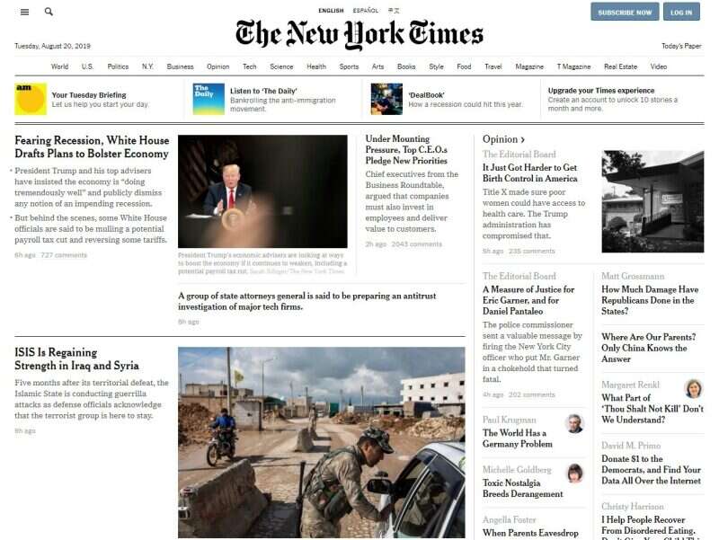
The New York Times homepage
Email pged@pressgazette.co.uk to point out mistakes, provide story tips or send in a letter for publication on our "Letters Page" blog
