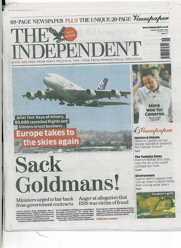
Comment: Former associate editor (design) of The Independent Michael Crozier gives his view on the paper’s redesign today
As the invisible ash swirls around in the air above Britain, The Independent is today attempting to rise again with a full-scale revamp.
In the redesigned, re-configured, paper news seems once again to have taken a backwards step – it’s comment and opinion all the way with the new 20-page pull-out Viewspaper section.
On page two we are told by Simon Kelner, editor in chief, that the paper has been re-designed by Cases and Associates from Barcelona. It is the same firm that was responsible for The Indy’s pioneering leap from broadsheet to tabloid in 2003.
The design is neat, clean and decidedly more upmarket than the previous redesign (There have been eight altogether since its launch in October, 1986).
The masthead typography is much lighter than carried previously; however, the symbolic masthead eagle seems to have lost much of its plumage.
The headlines inside are in a discreet font, called Sun, which helps lend the paper gravitas. Things change when readers turn to the Viewspaper where the fonts used are Farnham and Clan. Unfortunately the page identifiers, for sections Opinion & Debate, Obituaries and Notebook, appear pixilated – seemingly victims of a launch day production problem.
Echoing a look pioneered by David Hillman in The Guardian, extra white space (the washing line effect) is used under headlines. It looks good when the pages are free of advertising, as most are.
Despite some of the pleasing touches finding your way round can be hard. The Viewspaper has soaked up regulars sections, including the arts reviews, TV schedules and obituaries. It is also sad to see that a newspaper once world-famous for its use of photography is reduced to a front page image of a plane taking off. What about the volcano story? It has provided numerous evocative images.
The main paper also gives us a host of background features; John Walsh on libel laws; the misuse of the internet; Steve Connor on genes; senility and the effects of olive oil. Perhaps it’s the result of printing configurations but one would expect to read them in the much-trumpeted Viewspaper.
This new section is also let down by a weak title piece and a bizarre front page design with quote bubbles and shapes in a variety of discordant colours. Again there is no evocative image.
Kelner tells the reader that The Independent would most like to be judged by the quality of its content. I hope he can meet that pledge.
* Michael Crozier is a former associate editor (design) of The Independent. He redesigned the paper three times – in 1986, 1993 and 1998.
Email pged@pressgazette.co.uk to point out mistakes, provide story tips or send in a letter for publication on our "Letters Page" blog
