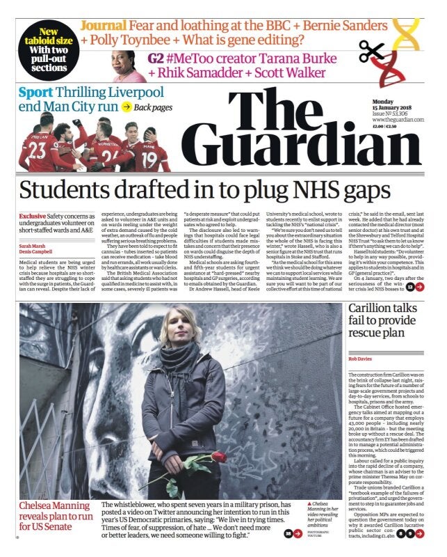
The Guardian has today launched in a new tabloid size complete with redesigned masthead and revamped design – gone is the blue and white colour palette and in is the black and red.
Having ruled out turning tabloid under former editor Alan Rusbridger, after the Times and Independent both made the leap, the Guardian caught a bit of cheek off its new compact rivals this morning.
Added to the Sun’s usual “20p cheaper than the Mirror” tease was “£1.50 less than tabloid Guardian”.
It said in a leader column: “…From one tabloid to another, here is our suggestion for them to turn around their failing fortunes: actually report some exclusive, rip-roaring stories…
“We know that is an alien concept to them, but it might help them flog a copy, or two.”
The Telegraph said it was “Britain’s biggest and best quality paper” at the top of its front page this morning while the i paper welcomed Guardian readers.
In its redesign, The Guardian has created a new headline font for the paper.
Its daily format has also changed, with content appearing in three sections: a main section carrying news, politics, international affairs, financial news and sport, a new daily pullout called Journal including comment, long reads, obituaries, letters and the cryptic crossword, as well as the G2 pullout including features, arts and culture, which has also been redesigned.
On Saturday, the Guardian will include five magazine supplements: a redesigned Weekend magazine with new features and columnists, Review books magazine, Guide, Travel and Feast – a brand new 24-page food mag that will feature restaurant critic Grace Dent.

The Guardian’s website and apps have also undergone a redesign in line with the paper, while the Observer on Sunday will feature a new masthead and revamped Observer Magazine.
Guardian editor Katharine Viner said: “Since we announced our plans to change format seven months ago, it’s been an exhilarating period of creativity, imagination and focus, and I’m thrilled with the result: a new paper that feels bold, striking and beautiful, and still unmistakably The Guardian.”
David Pemsel, chief executive of Guardian Media Group, said the change to tabloid was an “important milestone” in its three-year “transformation plan” to turn its finances around and will save several million pounds.
He said the plan was “on track” and that by April 2018 the group will have halved its operating losses within two years, reducing them from £57m to £25m per year. It aims to break even in 2018/19.
He said: “The media sector remains challenging. However, our reader revenues are growing well, and more people are reading us than ever before – we now reach over 150 million unique browsers each month and we have over 800,000 supporters.”
Printing and distribution of the new Guardian and Observer newspapers will be carried out by Trinity Mirror. The Guardian invested £80m in Berliner-size printing presses in 2005, these will now be sold off and the printing site closed.
The newspapers will also be printed in Scotland for the first time, leading to improved distribution for Scottish readers.
Left-wing commentator Paul Mason’s weekly column has been dropped from the Guardian, along with a handful of other commentators.
He said on Twitter: “Congrats to @guardian on redesign. Upside: masthead logo v sharp. Downside: no room for my weekly column anymore. It’s the best newspaper in the U.K. And I hope to go on writing for it…”
Mason said he would be writing for Novara Media and Open Democracy.
Deborah Orr and Giles Fraser have also been axed as regular columnists.
Elsewhere, reactions to the redesign have been mixed…
Welcome to the real world, @KathViner. Being tabloid suits you guys.. you just need a ‘free lentils for every reader’ promo & some hot lefty totty on Page 3. https://t.co/MCCkzSYa5t
— Piers Morgan (@piersmorgan) January 15, 2018
I quite like the look of this. I wasn’t sure if I would. https://t.co/cWxuA2ZUIX
— Tom Watson (@tom_watson) January 14, 2018
https://twitter.com/SachinNakrani/status/952840661170098176
Thanks for all the lovely tweets. It was an honour to play my part, but it’s actually quite liberating to no longer be “the guy who designed the @guardian”. Congratulations to @kathviner & @ajbreuer, lang may yer lum reek
— Mark Porter (@IamMarkPorter) January 15, 2018
Sure, I'm biased. But I was delighted to see – and read – today's new-look @guardian. It has pace, uses colour intelligently and the new typeface is elegant. Would have liked a separate sports section but that's just a niggle. All round, a great effort pic.twitter.com/YccoBn82H1
— Roy Greenslade (@GreensladeR) January 15, 2018
Bit biased, I know, but really like the verve and vigour of the the new tabloid #Guardian, particularly the sport section. Well done Guardian folk 👏 pic.twitter.com/huVL8PE8yi
— julia day (@julia_day) January 15, 2018
Have to say not sure about the new tabloid Guardian. It’s just not as pretty as the Berliner format. But the website is better so ho-hum. pic.twitter.com/t0Lfe3FCyK
— Lewis Goodall (@lewis_goodall) January 15, 2018
https://twitter.com/lowfatevil/status/952845308295352320
I'm not immediately wowed by The Guardian rebrand like I was with their previous. It's grave, which is perhaps fitting for 2017, but it's at the expense of character. Without the blue and their distinctive lowercase wordmark, their brand recognition will take a temporary hit. pic.twitter.com/uLKv2mmEVL
— Todd Atticus (@ToddAtticus) January 15, 2018
https://twitter.com/muzrobertson/status/952849301268520962
Picture: Guardian
Email pged@pressgazette.co.uk to point out mistakes, provide story tips or send in a letter for publication on our "Letters Page" blog
