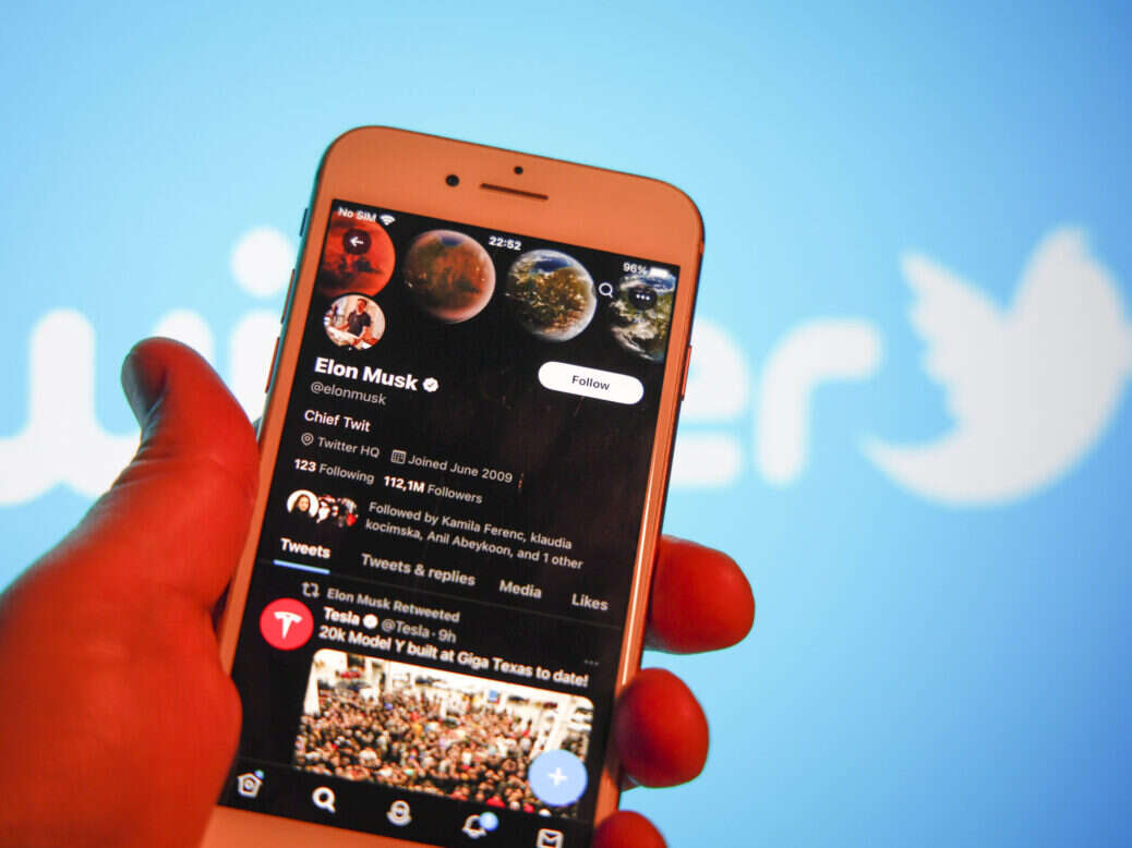
The decision to strip headlines out of the preview shown when news stories are shared on Twitter/X has reduced the amount of information a tweet can contain and annoyed many of the journalists who use the platform.
Jewish Chronicle head of digital Josh Kaplan reflected the views of many journalists when he said the change was “such a pain in the arse”.
“It’s made reporting on the Israel-Gaza stuff a nightmare,” he told Press Gazette. “Because there’s no distinction for comment or the nuance you used to be able to put into headlines that would display alongside [the link].
“And you can do all the careful social plugging you want, but the second someone shares it with whatever [comments] they want, you lose all that. Shit show!”
What can publishers do about the loss of headlines on Twitter?
Ian Silvera, the editor of Future News, told Press Gazette Twitter is coming to look “more and more like Youtube under Elon Musk’s ownership” with the introduction of headline-less thumbnails and creator monetisation schemes.
He said Musk’s latest update “means outlets will have to put more work into their preview pictures and thumbnail selection to keep the same levels of engagement as before. Expect more publications to take bespoke approaches – the FT is a good example of where it works well – and more pressure to be put on reporters to learn design tools like Canva and Photoshop.
“A potential second order impact could fall on stock image providers, with content creators and outlets asking more of them and their services.”
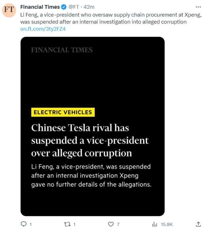
Below, Press Gazette has rounded up a selection of approaches publishers are taking to work around the loss of headlines from news links on Twitter/X. If we’ve missed any useful tricks, let us know at pged@pressgazette.co.uk.
Attach the featured image(s) directly to the post, type the headline and link to the story
Even prior to the removal of headlines, the Twitter accounts for Reach nationals the Daily Express and Daily Mirror didn’t generally use link cards.
Instead, the publishers attach each article’s featured image or images directly to tweets promoting them. The text of the tweet is made up of the story’s headline, or a simple variation of it, followed by a link to the story.
The strategy keeps the link visible, but means the picture will not link through to your website. The most obvious downside here is that this approach leaves few characters for pull quotes or other context, so the headline becomes all-important for selling the story.
Paste the link in twice
Pete Favan, senior editor at Bristol Live, told Press Gazette he had been pasting the relevant link into each tweet twice.
The first link calls in the picture card, he explained, and the second appears in the tweet.
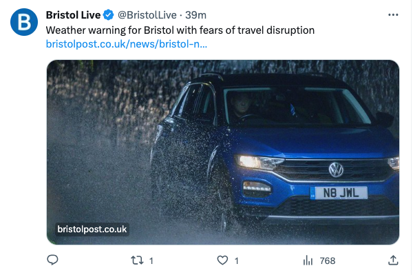
The approach has the benefit of making the link visible within the tweet, making it more obvious that a post is promoting a news story.
The drawback is that the second link subtracts from the number of characters available for the rest of the tweet, so publishers will still have to be economical with their headline and excerpt choices.
Use a screenshot of the headline on your own website as the featured image for the tweet
Andy Campbell, a senior editor at Huffpost, suggested that publishers screenshot the headline of each article as seen on their website and then attach that screenshot to relevant tweets, along with a link through to the full story.
Press Gazette has experimented with this approach. The benefit is that it fits much more information into the tweet – depending on the formatting of a publisher’s site, the attached image may include the headline, a pullquote, the featured picture, the website logo, the byline and the publication date.
Including that much information may be overload, however. In addition, if a publisher is tweeting an article several times over the day, these tweets quickly come to dominate an account’s entire media tab.
Add the headline to the Twitter image
News and opinion website Unherd has responded to Musk’s change by incorporating story headlines and bylines directly into their Twitter images.
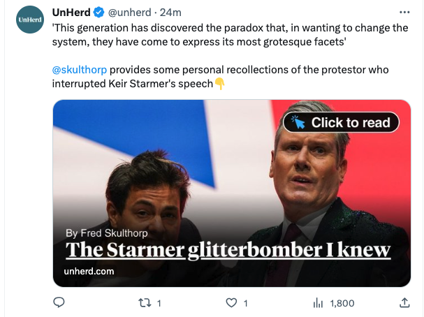
The site has also added a “Click to read” icon in the corner of the images to distinguish their article tweets from tweets which simply contain images.
This approach leaves plenty of characters in the tweet for publishers to use to sell the article, although it may strike some readers as visually busy.
Some content management systems allow publishers to use a different image for social media than the one that appears on the article itself. That feature is probably a prerequisite for this approach, as adding headlines onto images which also appear on your own website risks repeating information and cluttering the overall appearance.
For publishers with in-house tech capacity, it may be possible to retool a CMS so that this information is automatically added to the associated Twitter image. If your CMS is not geared up to do that already, this approach may be somewhat time intensive, requiring journalists or social teams to manually create a copy of the featured image which incorporates the new visual furniture using software like Canva or Photoshop.
Write your tweets as news-in-briefs
Even prior to last week’s Twitter update, New York Times tweets generally explained the gist of their linked articles without the help of the Twitter card. Now they appear to function even more as self-contained news-in-briefs, albeit ones that invite the reader to click through to read more.
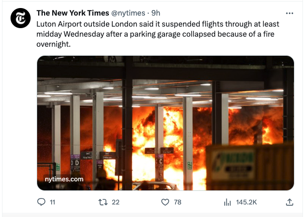
The drawback of this approach for news is that it does not do much to visually distinguish news article tweets from the rest of the content on X. However, the NYT does also publish some tweets which either add the headline into the attached image or explicitly signpost the reader on toward nytimes.com.
Tell readers to click the link
Media trade publication Deadline has adapted to the changes by replicating each article’s headline in bold (a feature which is available to Twitter Blue subscribers) and then explicitly telling readers to “click photo below for story”.
Break the new system (while you still can)
Links to some websites – for example that of the National Union of Journalists – still appear to function as they did previously by displaying a headline.
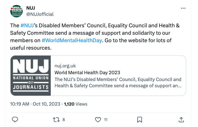
Full Fact web developer Andy Lulham reached out to Press Gazette with a possible reason for the inconsistency, saying: “I believe posts using the ‘summary_large_image‘ card format have been affected by X’s recent changes, but those using the ‘summary‘ card format (like NUJ’s tweets) remain unaffected. However, it’s unclear how long this loophole will last!”
Helpfully, Lulham said other publishers might be able to take advantage of the loophole in HTML by changing <meta name=”twitter:card” content=”summary_large_image”> to <meta name=”twitter:card” content=”summary”>.
And useful for users, if not as much for publishers: Control Panel for Twitter
As pointed out by Nieman Lab on Tuesday, it is possible for Twitter users to revert back to the previous view using the browser plugin Control Panel for Twitter.
The plugin is straightforward to use for anyone on a supported browser (Safari, Chrome on desktop, Firefox, Edge and Kiwi), but only changes how Twitter looks for you: unfortunately, it will not change how audiences not using the plugin will see publishers’ content. Control Panel for Twitter can be accessed from this link: https://jbscript.dev/control-panel-for-twitter
Email pged@pressgazette.co.uk to point out mistakes, provide story tips or send in a letter for publication on our "Letters Page" blog
