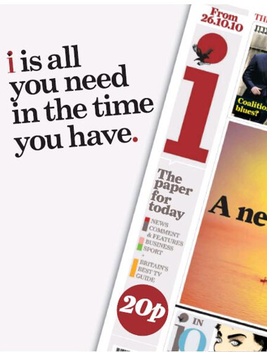
The little we have seen so far of the new daily newspaper being launched by the Independent next week – ‘i’ – suggests it may have drawn inspiration from the Portuguese newspaper of the same name.
From what we can see (in this ad from yesterday’s Evening Standard) the design will be radical, with a vertical masthead going down the left of the front page – rather than across the top.

Portugal’s ‘i’ launched in May 2009 and by the end of the year claimed to be the third biggest selling daily in the country.

It is radically different design wise from a conventional newspaper, looking and reading more like a magazine.
Instead of the usual news, features, comment and sport sections it is divided into Opinion, Radar, Zoom, and More.

(Then) editor Martim Avillez Figueiredo gave an interview which appeared in Press Gazette magazine in January this year.
He said: “Readers felt they needed a newspaper that gave a hierarchy to information that was dispersed in several platforms, and that gave them what many newspapers don’t give, which has rigorous editing (to highlight) that which deserves to be analyzed in depth…
“This is the way people nowadays relate to information, and we think this is the reason why the newspaper (i) has a high circulation, because it meets with the mind of the reader.”
According to the paper’s own research, 25 per cent of its readers generally never read newspapers before.
Looking at all the other UK national newspapers, they haven’t changed that much design wise in a century. They still follow typographical conventions from the age of hot-metal, direct descendants of Gutenberg’s 15th century moveable type printing press.
The Independent’s new ‘i’ could be a chance to follow the example of its Portuguese namesake and create a radically different kind of newspaper.
Email pged@pressgazette.co.uk to point out mistakes, provide story tips or send in a letter for publication on our "Letters Page" blog
