
These covers form the shortlist for the Periodical Publishers Association’s Great Cover Debate, the magazine trade association’s nationwide consumer poll to find the most iconic UK magazine cover of all time.
Forming a central part of Magazine Week 2008 (29 September-5 October), the poll will be open online at www.magazineweek.net for the public to vote on a range of shortlisted covers.
The shortlist will be displayed online for voting on for six weeks prior to Magazine Week. The winner will then be announced during Magazine Week itself, which has been established to celebrate the key role that magazines play in readers’ lives.
Selected from some 50 nominated covers, the shortlist was decided by a judging panel of leading industry figures including Andy Cowles, editorial director IPC Media; Jane Johnson, deputy editor News of the World and BSME chair; Ingrid Shields, freelance art director, and Jim Douglas, editorial director, Future Publishing.
Here, the nominators of the shortlisted covers give their reasons for believing why their choice should be the winner.
To have your say and vote for your favourite cover, go to pressgazette.co.uk/iconicmags

Empire, 2005: Breathing Darth Vadar
Paul Rees, editor, Q Magazine:
It becomes ever more difficult to do something within publishing that: a) breaks new ground; b) crystallises all that your magazine stands for in one image; and c) is as iconic in its own right as your subject.
The breathing Darth Vader cover did all that and more. It was a genuine one-off, and the last UK magazine cover that had every other editor think, ‘Now why didn’t I do that?”.

Heat, April 2006: Posh Spice
Debora Bradley, editor, Simply Knitting:
Heat’s covers are always punchy, but this is a defining moment. It instantly conveys everything you need to know about the mag and its view of the world.
Agenda-setting, with strong use of red and black to emphasise the drama, and all done with a straight face – ‘This is really serious”. Fantastic!
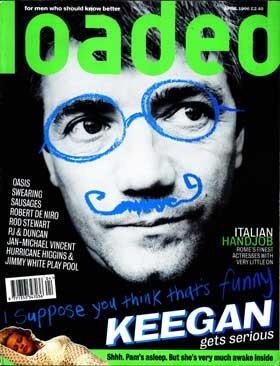
Loaded: Kevin Keegan
Derek Harbinson, editorial consultant and ex-editor of Loaded:
This is one of the great ‘poster’covers that put Loaded at the heart of the mid-Nineties men’s mag explosion. It has everything that Loaded was about: it’s full of brash confidence, irreverent wit and charm. It has the look of a classy, intelligent, quality publication that has been attacked by a bunch of kids with Asbos, which in essence was the exact editorial mix of Loaded.
With the balance of power now shifted firmly to celebrities and their agents, it’s almost impossible to imagine a magazine doing something similar now and getting away with it.

NME, 2007: Naked Beth Ditto
Guy Woodward, editor, Decanter:
This has attitude, impact, humour, relevance and courage. It demands attention, and shows brilliant powers of imagination and persuasion, along with the courage to go off-brand in terms of content while remaining absolutely on-brand in terms of message.

OZ, 1967: London launch issue
Conor McNicholas, editor, NME:
If you’re looking for an arresting cover this is it. It looks incredibly radical but it actually conforms to all the solid principles – it has a clear logo, ‘eye-contact’in the ‘face'(that forms part of the logo) and a good, clear descending hierarchy of typography and some good coverlines.
It’s a fabulous piece of typography from 1967 but it still feels very fresh. It feels like a work of art but if you put it on the newsstands today it would still deliver commercially by grabbing you and exciting you.

Private Eye, 1999: Blair speaks out
Danny Walter, editor, Mountain Biking UK:
Private Eye is a national treasure and this is just one of its great covers.
At a time when there was so much confusion and debate about GM foods and Blair was making such a big deal about them being the future, this cover said it all.
Radio Times, 2005: Vote Dalek!
Adam Pasco, editor, Gardener’s World:
The general election is this week and the public is wondering who to vote for. Labour, the Tories? No – vote Dalek! Radio Times captured the essence of the nation’s mood in a brilliant way and delivers on every level. The cover is totally unexpected and used the iconic image of a dalek to grab you at the newsstand. RT really made a statement with this cover that is simple and to the point and encapsulates the British sense of humour.

Take a break, January 1997: Eau de Bloke
Jo Chekley, editor, That’s Life!:
This cover was way ahead of its time, capturing the essence of the British sense of humour and daring to break away from tradition with its ‘skinny man’cover shot and tongue-in-cheek headline.
Aside from this it also addresses the real issues facing the British public – love, marriage, life, divorce, in a way that really resonates with readers.
With its honest approach to the true-life stories of ordinary British folk, this cover encapsulates what Take a Break is all about.

Nova, 1968: I have taken the pill, I have hoisted my skirts to my thighs…
Mandy Appleyard, editor, Fabulous:
In an era when recipes, romantic fiction and homecrafts ruled the magazine world, Nova dared to be different.
The words sum up the freedom of spirit, the defiance, the independence, the courage of young women daring to live life differently, as well as painting a surprisingly detailed portrait – in virtual bullet points – of one woman’s chutzpah and confusion. A life story in 41 words. The photograph shows a fashionable, sexy, beautiful woman, confident enough not to be eyes-to-camera. These two elements – simple but strong – make this the most memorable and seminal magazine cover of my lifetime.

OK!, 1999: Posh and Beck’s wedding
Catherine Westwood, editor, Wedding:
This showcases two cultural icons. They were both at the peak of their popularity and careers – and the public just couldn’t get enough of them. It also revealed ‘real’people could make it big and get paid millions for pictures of their wedding – and in doing so, set the benchmark for future celebrity nuptials. Since this cover, the Beckhams have become a brand – a true sign of our celebrity-obsessed times.
Nine years ago OK! tapped into the UK’s desire to feel involved in the lives of the rich and famous. It provided the entire British public with a front-row seat at a very personal event, which glittered with stars.

Tatler, April 1989: Margaret Thatcher
Andy Cowles, editorial director, IPC Media:
This cover really is exceptional work. It’s a great idea, a great photograph, and a great piece of design.
But it’s also a great British cover with the way it welds the image of both Thatcher and Westwood together to serve under the Tatler banner.
It takes the very British ability of holding two ideas in mind at the same time. It makes you look twice, it makes you think twice, and it makes you smile.

The Face, 1980: Launch issue
Martin Daubney, editor, Loaded:
When The Face came along it felt like, ‘At last, here’s a magazine that speaks to me, one that our parents would hate”.
It was pure rock ‘n’ roll, stylish, sexy and about 25 miles up its own arse. Perfect teenage reading.

Time Out, 1974: V sign
Damian Wild, editor in chief, Accountancy Age:
Provocative, contrary and arresting, this Time Out cover provided, in its own words ‘an antedote [sic] to the current stream of Churchilliana’sweeping a Britain celebrating the wartime PM’s centenary. In flipping the most famous two-fingered salute of all, it delivers everything a good cover should. It would have captured the mood of the magazine’s own battalion of readers, would certainly have converted more than a few neutrals to its cause and flicked a confident ‘V’at everyone else. What’s more, unlike many 30-somethings, it’s stood the test of time remarkably well.

Vanity Fair, March 1997: London Swings Again
Miranda Levy, editor, Mother & Baby:
It has to be Vanity Fair’s London Swings Again cover. It’s March 1997, Tony Blair is two heartbeats away from Number 10, and here are Liam and Patsy, swathed in a Union Jack bedspread, giving us buckets of contempt and attitude.
Ali Hall, editor, Look :
This cover summed up the mood of Britain during the mid-Nineties referring to ‘Britpop’bands such as Blur and Oasis, fashion designers, young British artists and magazines. The cover made me want to be a part of the fashionable London scene at this time.

Vogue, December 2001: Kate Moss
Ingrid Shields, freelance art director:
This cover has everything… three great institutions that have been selling magazines for years – the royal family, Vogue and Kate Moss.
It has the classic ‘black, red and white’palette with a stripped-back, confident headline reflecting the attitude of the image.
It has tradition and modernity in equal measure – something the British do well. Vogue has survived by constantly reflecting the ever-changing world of fashion and, with this cover, the mood of the nation.

Vogue, 1997: Diana tribute issue
Louise White, editor, HAIR:
Diana, Princess of Wales, was not only a fashion inspiration for women around the world, but she was also a muse for some of fashion’s most prominent figures.
Clothes were her language. Her choice of dress could communicate her personality and feelings more than any article or book.
Quite simply, she was the most influential style icon of her time. There were many tribute covers dedicated to Diana after her death, but none, for me, more fitting or poignant than the cover of fashion bible, Vogue.
Email pged@pressgazette.co.uk to point out mistakes, provide story tips or send in a letter for publication on our "Letters Page" blog