


With the latest ABCe figures, Mail Online has stormed into first place as the most popular UK newspaper site. Editorial director Martin Clarke ascribes this to investment in content, but the site’s redesign has also obviously gone down well.
The Mail initially rolled out the new design as a limited ‘beta’in April. This allowed them to test the technical platform, and gather valuable feedback from users about what they did, and didn’t, like.
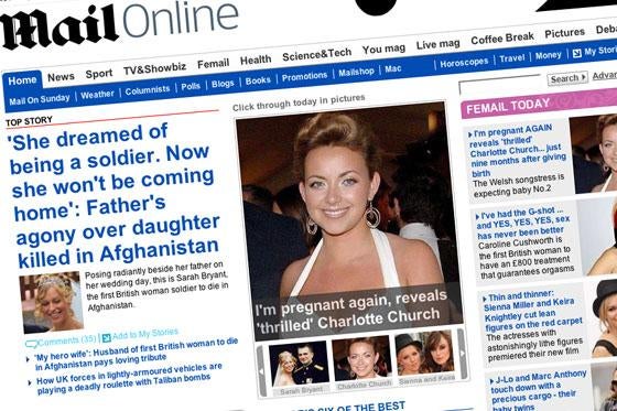
The new homepage is more visual than the previous design, with a large space ‘above the fold’devoted to the day in pictures. Clarke cites investment in news and sport as key to Mail Online’s future, but I suspect that a lot of the increased usage of the site is down to the Mail’s eye-grabbing TV and showbiz coverage. This is highlighted all down the right-hand side of the new homepage in a series of picture promos.
Celeb-spotting
Related


Sticking with the showbiz theme, there is innovation in the presentation of content using RSS. Although some newspapers have feeds dedicated to events such as Big Brother, Mail Online is the first national newspaper to offer online RSS feeds based specifically around individual celebrities such as Cheryl Cole and David Tennant.
The site has lost the left-hand navigation panel that used to exist on the old design, and so the navigational focus is now on a horizontal bar underneath the masthead. This mixes together topic areas such as news and sport with branded content areas from the printed paper, such as Live magazine and the Coffee Break section.
One concern with the design is that by opting to be so graphic-led, the pages take longer to download. The Mail risks locking a large user base out of the site. For the 2.6 million Britons still on dial-up internet access, the Mail’s homepage will take more like minutes than seconds to load. The homepage is very long as well – typically with links to around 140 pieces of individual content, which is quite overwhelming.
Content from our partners


Comment
User-generated content features strongly in the new design. The majority of stories allow Mail readers to add comments, and there is an emphasis on the debate section, which features new and improved message boards. The debate index entices users by pitting the Mail’s comment against a couple of selected quotes from users on the topics of the day.
My only reservation with the new boards is that they default to showing the most recently published message first. This means users coming to a thread for the first time have to scroll to the bottom of the page and read upwards.
There are some nice touches on the redesigned sports page, included a visual navigation selection for Premiership football teams. Users click the club badge to go straight to a page dedicated to that team.
The content they find there is not just from the Daily Mail’s sports desk, either. In a bold move to become more of a content ‘hub’than simply being a content provider, the Mail is incorporating feeds of headlines relating to each club from other sources. This includes material from online competitors such as the BBC and Sky, and rival newspapers including The Sun. This approach shows a great deal of confidence in the online brand, as it expects people to use the Daily Mail as a starting point on the web, to which they will return after visiting other sites.
Strong start
Overall, I think this a very solid redesign from the Mail Online team, with the focus very much on their strengths as a newspaper brand, closely tuned to the interests of their readers. Personally, I’d like to see slightly smaller index pages, both in length and in download weight. However, the innovative RSS feeds, and open approach to linking out to other news sources show the Mail has developed an advanced web strategy, and, on the basis of this design, it looks well positioned for online success over the next couple of years.
Martin Belam is a Crete-based internet consultant. He blogs at www.currybet.net
Email pged@pressgazette.co.uk to point out mistakes, provide story tips or send in a letter for publication on our "Letters Page" blog