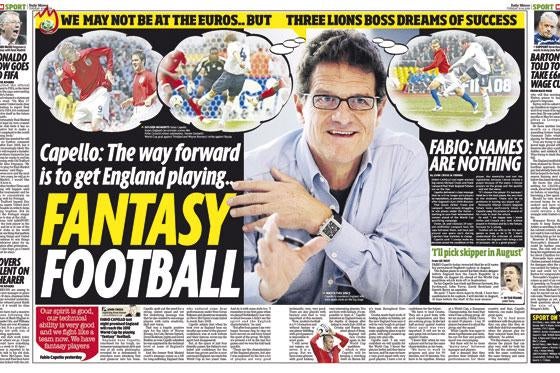
The Daily Mirror’s redesign is more than just a new look. To the team behind it, it is an attempt to end a 40-year identity crisis brought on by the relaunch of Rupert Murdoch’s Sun in 1969. Since then, the 105-year-old tabloid, the original red-top, has struggled to define itself against its old rival.
The redesign is an attempt to distinguish the paper and communicate its very different values.
Matt Kelly, the Mirror’s associate editor, led the paper through the 18-month design process, with Trinity Mirror hiring Spanish design firm Cases Associats, the people behind relaunches of The Independent titles as well as leading papers across Europe and Latin America.
‘In 1903, the Mirror invented the concept of popular journalism – at one stage it sold seven million copies in one day. It didn’t do that without being innovative and brilliant,” Kelly says.
‘But it lost its way 40 years ago when Rupert Murdoch took a newspaper we owned called The Sun and relaunched it as a tabloid.He stole our clothes. And that was the start of an identity crisis that we are only now beginning to shake off.”
The Mirror held focus groups and found that while loyal readers could see the difference in appearance and values compared with The Sun, occasional buyers could not.
‘People who bought the Mirror day in, day out laughed and said: ‘The Sun’s a comic, the Mirror’s a real newspaper’, which was very nice to hear,’Kelly says.
‘But when we asked people who didn’t buy us every day, they shrugged their shoulders and said: ‘They’re not much different, they’re much the same’.
‘Anybody who knows anything about newspapers knows that the Mirror and The Sun are very, very different products. So why do people think we are the same? Because we look the same. Finally, through this process, we’ve set out to claw back our own identity.”
The new look, with entirely different fonts, headings, full-colour pages, icons, graphics and more coherent features sections such as Your Life, has led some to describe it as magazine-like.
But for Kelly, this criticism ‘is purely to do with the amount of colour. It’s something people are getting used to. It’s nothing to do with the design or the content”.
He says the Your Life women’s features section – modelled on women’s glossy magazines – is a ‘daily magazine”. It is one of many ‘sub-brands’within the paper that the new design has attempted to give a distinct identity, along with Your Money, Mirror Sport and comment, which could be expanded to work online or even on mobile.
Kelly has also been deeply involved in the redevelopment of Mirror.co.uk, which is expected to be relaunched this year. But he declines to say more about the shape of the new website or whether Cases – which also offers web development services – is involved.
There are, he says, ‘plans for every platform”, although some are in the early stages.
Francisco Amaral, the Cases director who led the design team, says this project posed unique demands.
‘The Mirror is the biggest challenge we have had,” he says. ‘When they came to the studio and we started to talk, Matt asked me: ‘What are you going to do with the paper?’ and I said: ‘I don’t know!’ The Mirror invented a kind of paper and lots of people have tried to copy it.
‘What we normally do is try to get into the client’s life, what they do and what the market is, but in the case of the Mirror, we came with an army of designers to understand what they are doing and develop an understanding of the Mirror’s principles.”
The process of evaluating the paper and considering its identity has had wider effects on the Mirror’s journalism, says Kelly.
‘Even if we didn’t change a bloody thing in the design, the value of hiring Cases is that every single journalist out there is now thinking about what we do and why we do it.”
The Mirror design team – which have seen news and features combined into one desk – now treat stories according to what is deemed ‘important’and ‘interesting”. For lighter human interest and showbiz stories, the headlines are italics and pictures are bigger. For serious, hard news, colour is still used but the headlines are straighter and there is more text.
The Cases team looked through Daily Mirrors from all eras when drawing up a new look, but were also inspired by wider culture – they borrowed typefaces and design trends from everyday signs and posters. The main headline typeface, a new
font simply called Mirror, was adapted from Transport for London’s typeface used on the Underground, Johnston Sans, first used in the Thirties.
Kelly says: ‘Journalists are all shock-horror, asking: ‘What are all these italic headlines?’ – but the fact is there’s not a single thing in the Mirror redesign that our readers aren’t seeing elsewhere in the world.
‘These are types, icons and colours they are already seeing in the magazines they read and the places they shop, on the internet and on TV. We have no problem incorporating that into a newspaper. The readers don’t recoil, they appreciate it.”
Amaral agrees. ‘UK red-top readers love design – they buy nice stuff. Nice plasma TVs, nice clothes, well-designed, so there’s no reason not to sell a well-designed paper.”
Kelly says the redesign is ‘about 80 per cent done”, with sections such as Your Life and Mirror Sport fully completed.
Mirror editor Richard Wallace might decide on further changes, but Kelly says he ‘suspects deeply’that the paper’s iconic red masthead will remain untouched.
‘This thing about red, black and blue – the readers out there don’t give a toss. We know this for a fact. It’s a fact that red stands out better than any colour on the newsstand, so commercially that’s why we have it,’says Kelly.
‘If being a red-top means being a popular daily newspaper then damn right we are and we always will be.”
Email pged@pressgazette.co.uk to point out mistakes, provide story tips or send in a letter for publication on our "Letters Page" blog


